CI
- home
About KOMIPO
CIP
CI
About CI
‘Energy’ that powers the world
‘Light’ that illuminates the world
‘Center’ of the energy and light
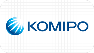
Symbol Mark

To convey our vision (A green energy leader, creating a clean tomorrow), the images of ‘energy’ and ‘light’ are captured based on the shape of the ‘earth.
The circle symbolizes the value sought by Korea Midland Power as a ‘global energy enterprise’ for humankind, the seven lines represent the dynamic movement of the ‘light’ that moves towards the world breaking the darkness, and the blue color embodies the integrity and boundless challenges of the members of Korea Midland Power who seek to open up the future with clean energy and technology.

Color system

PANTONE
3005C
CMYK
C100M40
RGB
G125B197

PANTONE
654C
CMYK
C100M65K24
RGB
G76B140